This is a big moment for Slurp: we are finally publishing our new visual identity that we have been preparing in silence since early 2017. We are very excited about refreshing our appearance and that we can henceforth better convey our values and ideology also in visual form. In this post I’ll dive deeper into the ideas behind the new identity, why we wanted to update the appearance in the first place and how we made our way towards the final outcome. However, to understand better where we are coming from, let me first tell you a little about the previous visual appearance.
Slurp’s identity 2014–2018
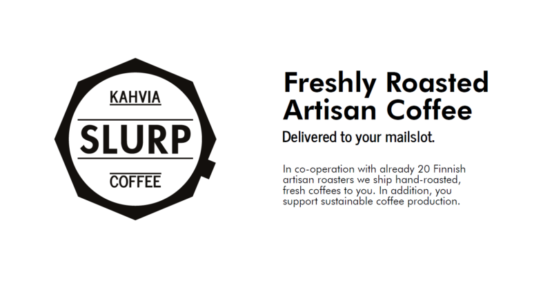
The original identity was born in the summer of 2014 after we had finally decided on the name through a multitude of suggestions. We were especially focused on our logo, since typically that is the strongest symbol connected to any company’s operations. The logo had to represent our values and connect to the bigger idea behind Slurp: to bring the enjoyment of discovering always new flavours and experiences found in freshly roasted artisan coffee straight to everyone’s home. Through many versions and concepts we finally came up with the idea of simply putting our name into the shape of a moka pot — the delicious, exciting and wonderful product ready to be enjoyed: Slurp!
In the beginning our site and appearance used a lot of very strong colours while the logo itself was always black or white. With the colours we wanted to convey the idea of different flavours, experiences and joy. However, over time the use of strong colours became less and less and the overall appearance more black and white with some accentuating colours here and there. Moreover, we began to feel somewhat constricted by the appearance, since it had come from my own, non-graphic-designer pen, and had gradually grown unconsciously instead of having a clear set of visual guidelines from the outset. From this rose the need to rethink our whole approach to our identity and how we want to convey what we do in visual language: to have a well considered and cohesive take on communicating our values and who we are as Slurp.
Creating the new identity
The push to finally start creating a new identity came from Julia Nyyssölä, a budding graphic designer from Helsinki who I had met in Japan. She wanted to help us crystallise our identity as her final project for school. The timing couldn’t have been more perfect, so we started work in early 2017.
We worked together for four months first understanding who and why is Slurp, where we want to go with it, conducting ten workshops, an exceedingly long customer survey with over 500 responses (thank you!) and endless discussions and iterations on shapes, styles, colours, typography and everything from the smallest detail to the future of the whole world.
The conclusions from the process went straight to the core of our identity and back to where we first started. Julia’s final conclusion summarises perfectly what is at the heart of Slurp. This became the basis for the design process of the new visual appearance.
“Coffee is a happy thing. Slurp’s visual identity is fun, colorful, humane, and easy to approach. It praises diversity and uniqueness.”
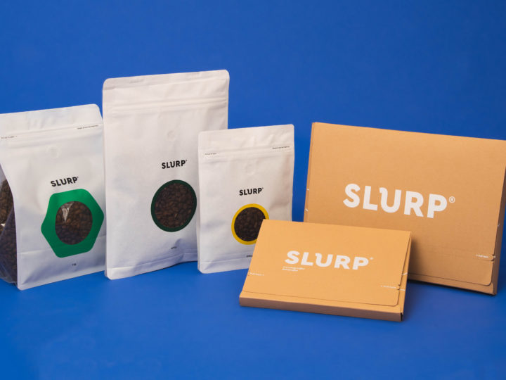
The design choices that followed all tied back to the same themes. More broadly, important qualities to us were joy, diversity, exploration and discovery, enjoyment and uniqueness, tying in with humanity. We wanted our visual appearance to be simple, strong and interesting. The cornerstones of the design came to be Swiss design, modern UI design and a retake on pop art as an antithesis of its original purpose: we are creating a service with technology where everyone in the world can enjoy something unique to them instead of mass produced identical items.
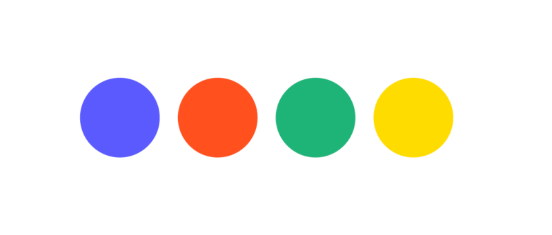
After countless options we finally found a palette close to basic colours that clicked with what we want to communicate. The same principles applied to the typography we chose: something with strong character, yet being playful enough to convey joy over seriousness.
Aside from the colours, the actual logo was going through at least as many versions. We approached the logo design from endless angles ranging from more abstract and conceptual ideas to simple, nice looking shapes. All the time we kept coming back to where we had started, which proved to be the key to success: looking at the previous logo, we saw that it already communicated a lot of the things we wanted to crystallise into it. It tied together the origin of our name (the sound of thoroughly enjoying a delicious cup of coffee as well as to the act of slurping to enhance flavours, as is done in cupping coffees amongst other things), with an interesting shape that was both strong and connected to the world of coffee. Moreover, the shape also resembles a chat bubble conveying further the idea of a service and products that allow people to enjoy and share their experience.
![]()
We are very happy with the final result and can’t wait to start exploring the possibilities of the new visual identity in always new applications. Already during the basic implementation it has proved to be fun and easy to work with.
We would love to hear your thoughts and comments on our new identity. Please feel free to leave a comment here or shoot us a message at info@slurp.coffee. We will read all your comments thoroughly, with thought and respond in kind.
Finally, I want to express our gratitude to all our dedicated customers, partners and supporters for the ongoing, amazing support you are giving us every day. This is just the beginning.
Rafael Linnankoski
Co-founder, design
Newer
#83 Cafetoria Roastery: Summer Blend
Older
#82 Turun Kahvipaahtimo: Espresso Brazil Santos Barbosa Gold
Comments (0)
Leave a reply
You must be logged in to post a comment.